Sunday 6 November 2011

Shutter Speed Assignment

Here are some photographs I have taken using slow shutter speeds:

 1/2.5s F8

30s F22
 1/2s F5.6
 1.3s F4.5
 1.6s F4.5

1.6s F4.5
 6s F5
 6s F5
 6s F5

6s F5

6s F5
 6s F5
 1s F22
1s F14

Sketch Book Pages

Here are a few pages from my sketchbook. I can never make anything look neat!


Saturday 5 November 2011

Final Studio Photographs

Here is the first of my final images. I decided that I liked one of the ideas enough to use it as my final shot so I did not need to do much more editing. A new line of the Old England watches is called New Union, hence it reading New Union in the left hand corner. I could not find the exact font that Old England use on their watches, but I did notice that it was very similar to Old English. I downloaded the font and then, using Photoshop, I erased part of the letters so that it would look like Old England's font on their watches.
Overall, I am really pleased with the outcome of this. I think that it was a good idea to enhance the colours as it looks more modern and fitting to what I think the company would use now.


This is the second of my final images. I did alter the colours after the sample I made and I put more yellows into the highlights to give it a much older feel. I chose to use the Birch Standard font because I thought that it was fitting to the style of the image, the era of the record player and clothing. Unfortunately I could not find a nearer match to the His Master's Voice font the company used to use, but I am happy with what I found.
Overall, I think the image works well with the font. I also like that it looks like an old advertisement, which is what I was aiming for.


This is my last image. I was happy with how it turned out in Photoshop when I edited the colours. I managed to find a typeface that looked like the Danelectro font. I decided that I would try to make the font bend round one of the curves on the guitar. It took a long time for me to get the angle right and after I had done it, I found that it didn't look as good as I expected and was quite disappointed with it because I had taken an hour or so trying to get it right. I thought that I should leave it as it is because I did not want it to look like an effort had not been made with it. I am however, happy with how the image looks now, especially the light on the scratch plate.


Portrait Shot: HMV Record Player

For my studio session where I would be taking portrait photographs I needed this equipment:

Nikon D90
2x softboxes
2x umbrellas
4x Bowens Gemini 750w
Radio Trigger Unit
1x Tripod

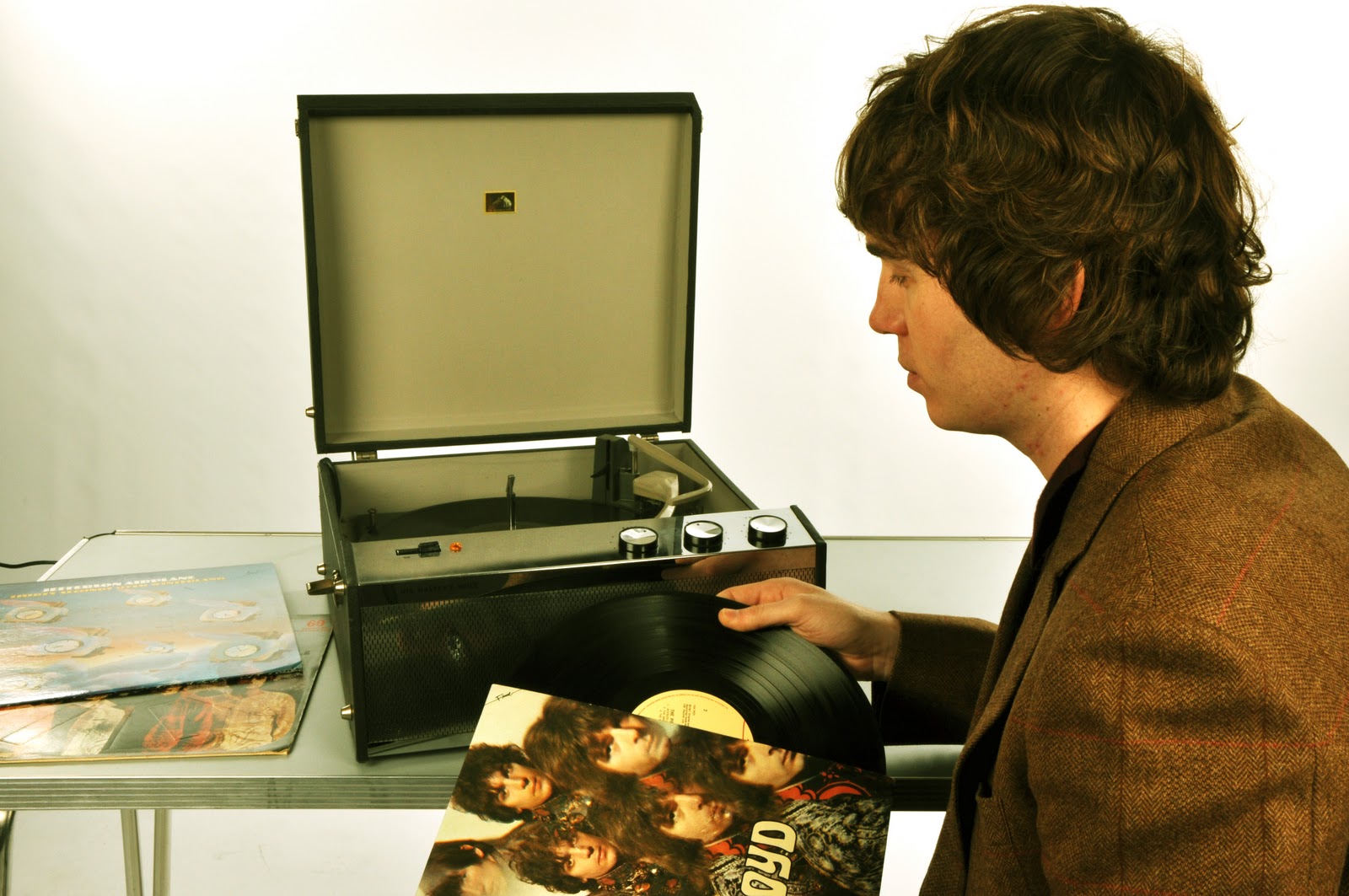
I originally had the intention of taking photographs of the model standing up. I did a few test shots (below) and realised that it didn't work as well as I had anticipated. The table was so low and the model was so tall that it looked like he was stooping, leaning very awkwardly to put a record on and it didn't look very natural at all. I then decided it would probably be a better idea to have him sat down. By doing this, the record sleeves could then be seen properly.

Here are the images of the model that did not work:


And here are 6 images I liked the most:

I think that the model is not facing the camera enough in this picture and I think that the position of the record is hiding the record player too much. (above)

I don't think I will be able to use this image for my final piece because of the shadow in the back ground and it is a bit underexposed. (above)

 
This image is my favourite, there is no shadow in the background and you can see everything perfectly in the picture. (above)

I then decided to play around on Photoshop to see what kinds of effects I could give my pictures and what I could use on my final picture.

 For this photograph I used the colour balance tool and gave it yellow and blue highlights.
 In this picture I lowered the saturation and moved the hue slightly.
 Here I lowered the saturation and contrast. I also changed the hue slightly.
 This photograph has had the shadows, highlights and colour balance altered.
 On this photo I exposed it a little bit, altered the colour balance to have more red, green and yellow and also made the contrast higher.

What I will do next: I will chose an image out of the 5 above, edit it in Photoshop using the effects from the above images that I like the most. I will also attempt to smooth out the dent in the front of the record player, the legs of the table and also the wire from the record player.

Product Shot: Old England

For my studio session where I would be taking photographs of an Old England watch I needed this equipment:

2x Bowens Gemini 750w
1x Matthews C stands with sandbag
1x Tripod
1x Nikon D90
1x Macro Lens
I really like this image because I feel that the composition works well. I like that part of the watch is out of shot, leaving enough room on the side of the picture for text. (above)

I like this one because the font isn't at an angle and that you can see part of the chain. (above)

I decided to move the watch across to the left of the camera but I feel that I cut too much of the watch out of the shot.

I then went on to edit these 6 images in Photoshop to see what effects I liked and what I could use on my final piece.

This photograph has had the vibrance and saturation made higher.
Here I altered the colour balance and made the cyan, magenta and blue higher. I also made the contrast higher too.
I only altered the saturation and contrast in this photograph.
For this image I made the contrast a lot higher, made the gamma a little higher and exposed it slightly.
On this photo I have used the colour balance tool and made the cyan and blue higher. I have also lowered the saturation and made the contrast higher too.
I used the black and white tool to lower the saturation and to make the yellow and red colour balance. I also made the contrast higher to make the watch face stand out more.

On all of the above images I had to use the spot healing brush tool to get rid of flecks of dust and tiny scratches.

What I will do next: I intend to chose an image from the 6 above and apply my favourite effect to it. I will need to use the spot healing brush tool a lot more than what I did in these above images.

Product Shot: Danelectro

For my studio session where I would be taking photographs of a Danelectro guitar I needed this equipment:

2x Bowens Gemini 750w
1x Matthews C stands with sandbag
1x Tripod
1x Shooting table
1x Nikon D90

I positioned the guitar on the shooting table with the light facing down onto it. These are the following images I narrowed down to the ones that I liked the most:

 I particularly like the angle of this, the fact that you can see the strings and part of the scratch plate. I also like that there is a bit of reflection on the pick up. (above)

 I think that this image is too bright. I think that this image could have been better by having more of the body of the guitar in the shot. (above)


Here I have edited the above 6 images on Photoshop to see what colour effects I could use on my final piece:

 On this image I have made the vibrance and contrast higher.
 I only lowered the saturation when I edited this image.
 I decided to experiment with a filter in this image and I chose a sepia filter for it. I also made the brightness higher.
 Here I made the contrast higher and used the colour balance tool to bump up the reds, greens and blues.
 For this image I lowered the saturation and made the extended the contrast.
This photograph has had the saturation lowered and the contrast put up to 100. I then used the contrast tool again and added an extra 30 to the contrast.

What I will do next: I plan to chose one of the above 6 images, find an appropriate font and apply an effect to one of the images.